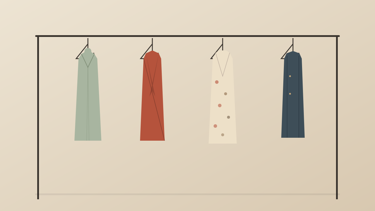
Color matching is one of the most powerful yet underutilized skills in personal style. Understanding which colors work together — and why — transforms an outfit from a random collection of pieces into a cohesive, intentional look.
The Color Wheel Fundamentals
The color wheel is your primary tool. Colors that sit opposite each other on the wheel are complementary and create high contrast — blue and orange, red and green, purple and yellow.
The 60-30-10 Rule
Interior designers use the 60-30-10 rule for color balance, and it works equally well for outfits. Sixty percent of your outfit should be a dominant color, thirty percent a secondary color, and the remaining 10 percent your accent color.
Matching Neutrals with Confidence
Neutral-on-neutral outfits can look sophisticated or flat depending on execution. The key is varying the tone and texture within the neutral family.
Understanding Your Undertone
Colors that flatter you depend on your skin undertone. Cool undertones look best in jewel tones like sapphire, emerald, and ruby, as well as in black, white, and grey.
0 条评论
还没有评论,来发表第一条评论吧!
发表评论